Copyright MJR UX Design © 2024
All Rights Reserved
AR Native Mobile Application, Gillette Stadium
Duration: 2 Months
Project Summary: Designed the augmented reality
experience for a native mobile application to be
used by employees at Gillette Stadium to measure
bag sizes.
My Role: Visual Design / Strategy / Branding / IA /
Prototyping / Testing
Bag Approver App
Ideation & Strategy
Event goers complained that it takes a long time for them to
go through the gate security.
To reduce wait times at the stadium gates
To speed up the bag checking process
Product Manager
Software Developer x2
Gillette Stadium Entrance
personnel - Supervisors
and Bag Checker
Gillette Stadium - Marketing Manager, CTO, Sparq - Account
Executive, Account Manager
Native Mobile App
Dev - Unity
Design - Figma, FigJam
The Challenge
Business Goals
Collaborators
Target Audience
Stakeholders
Platform
Tech Stack
After conducting a competitive
analysis and assessing the
navigation flows of similar
applications, the user experience
was drafted using FigJam.
Several rounds of review and testing with stakeholders revealed the need to further simplify the user flow. The image
below showcases the final flow.
Mobile Wireframes:
Tablet Wireframes:
Bag Sizing App - Gillette Stadium | Style Guide
Bag Sizing App - Gillette Stadium | UI Design Kit
Testing & Final Solution
Lessons Learned
As I worked to finalize this project, I learned that good UI does not mean having an overly
embellished application with tons of buttons and actions. Sometimes, one button can be enough.
“What really stood out, though, was her ability to quickly onboard mid-project when we needed coverage, seamlessly picking up where another designer left off. That’s no small feat, but they handled it with confidence and efficiency. Beyond her skills, she was a fantastic teammate. Always willing to share knowledge and collaborate to make the work stronger. Any team would be lucky to have her!“
James Williams, Product Design Leader - Sparq
Design & Iteration
Move all action buttons to the right-hand
side, bottom corner of the UI
Make it easier for users to reach buttons
with their thumb when holding the tablet
with two hands
Remove “Exit App” button from main
navigation as it is redundant for iPads
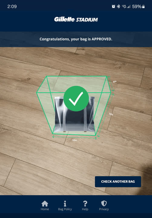
Computer Vision and AI work together in this app to
automatically detect the user’s type of bag and its shape
Simple, straightforward UI with easy to follow in-app
prompts for users
Near-perfect match to Gillette Stadium’s main mobile
application branding
Seamless navigation between the two Gillette Stadium Apps
Working closely with PM and
Software Engineers during semi-daily
design reviews where I shared early
prototypes, I was able to further
refine the overall user flow and fine
tune the look and feel of the UI.
After a final review session
with the Software
Developers, I handed-off
the Figma Dev version file
that also contained the UI
Design patterns and
accessibility considerations.
Usability Testing Insights:
Final Solution - Main Features:
Collaboration:
UI Patterns:
UX Design
Work
Process
01
User Task
Flow
Diagrams
02
Build
Wire-
frames
04
Usability
Testing
03
Iterate
&
Prototype
05
Corporate
Branding
06
Final
Product
HOME
HOME